Rapid product growth across multiple platforms, teams, and tech stacks resulted in fragmented design patterns and inconsistencies.
To ensure a cohesive user experience, we set out to rebuild and streamline the design system—developing reusable components, clear guidelines, and a seamless adoption process.
Client
Christies
Role
Senior product designer
Year
2024

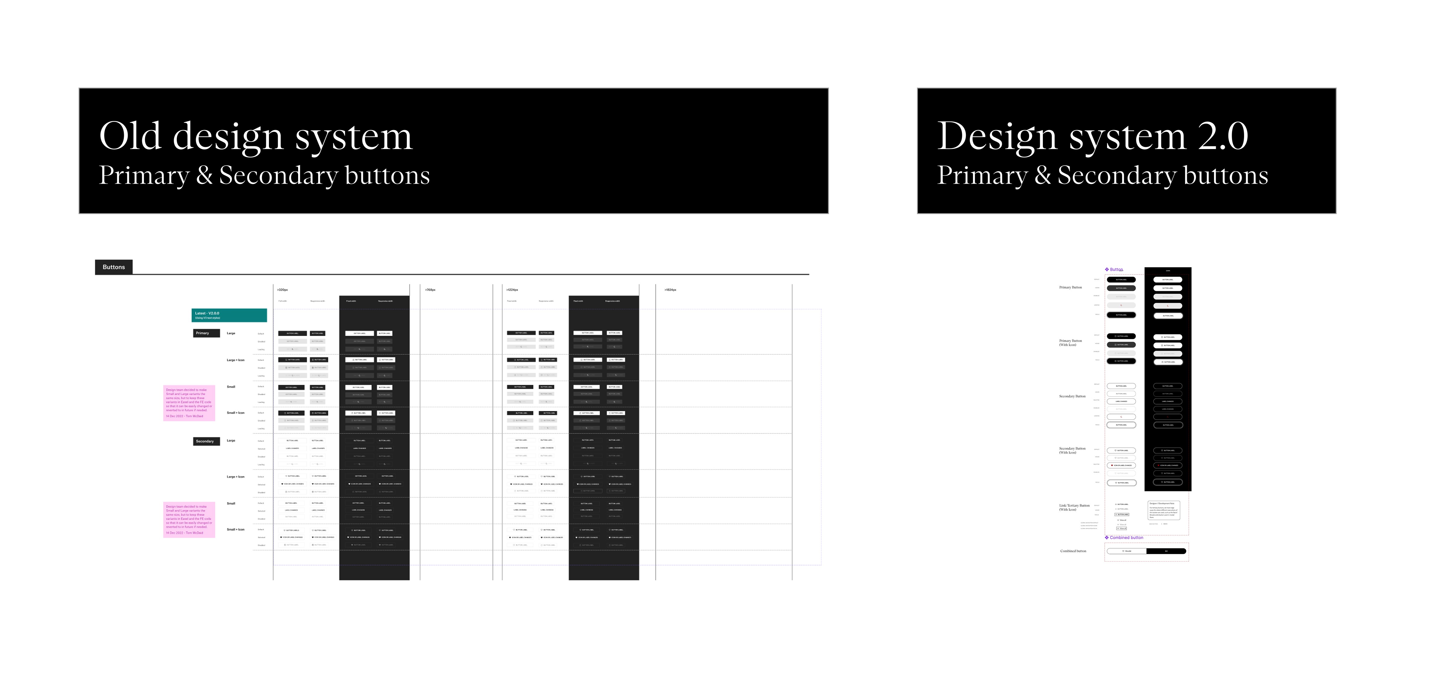
As the design team expanded, individual contributors worked on separate projects, adding and updating the design system without a formal structure. This led to inconsistencies in component creation and variant management, causing the system to become fragmented—spanning the DS into ten Figma files with multiple pages.
The lack of organization made it difficult to find components, slowing down workflows and reducing efficiency. At the same time, a branding update rendered the existing system outdated.
Recognizing this as an opportunity for improvement, we initiated the development of our design System called easel 2.0 while maintaining the legacy system to support a smooth transition until full migration was complete.

First step involved auditing the ten Figma design system files into four key areas:
➤ Atoms
Basic UI elements (buttons, icons, colors)
➤ Molecules
Small reusable design patterns
➤ Organisms
Larger, fully functional components
➤ Documentation
A central guide for designers and developers
We then transitioned the components using Figma best practices (simplifying structure and reducing variants) to establish a solid foundation for the system.